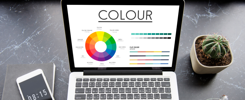
In the digital age, a website is more than just a collection of pages; it is a powerful representation of your brand’s identity and values. Among the many elements that influence how visitors perceive your site, colour stands out as one of the most impactful. Colour psychology- the study of how colours affect human behaviour and emotions- plays a crucial role in web design. The colours you choose for your website can evoke specific feelings, influence user decisions, and even affect how long visitors stay on your site.
For businesses looking to create a strong online presence, understanding the psychological effects of colour is essential. When applied thoughtfully, the right colour palette can enhance brand recognition, create emotional connections, and guide users toward desired actions such as making a purchase or signing up for a newsletter. This makes colour selection not just an aesthetic choice but a strategic decision that supports your overall business goals.

Understanding the Role of Colour Psychology in Web Design
Colour psychology is the study of how colours influence human emotions and behaviour. In web design, this knowledge helps designers choose colours that align with the brand’s message and appeal to the target audience. Different colours can evoke a wide range of emotional responses. For example, blue is often associated with trust, calmness, and professionalism, making it a popular choice for financial institutions and healthcare providers. Red, on the other hand, is linked to excitement, urgency, and passion, which is why it is frequently used for call-to-action buttons or sales promotions. Yellow can evoke feelings of happiness and creativity, but may also cause eye strain if overused.
The impact of colour goes beyond just emotional response. It also affects how users navigate and interact with your website. Conversely, poor colour choices can confuse users, make content hard to read, or create a negative impression of your brand.
Building a Cohesive Brand Identity with Colour
Your website’s colour palette should be a direct reflection of your brand’s personality and values. Before selecting colours, it is important to define what your brand stands for and who your audience is. This clarity will guide your palette choices and ensure consistency across all touchpoints. Typically, a colour palette consists of a primary colour that represents the core of your brand, secondary colours that complement the primary, and neutral colours that balance the design and provide background space.
Consistency in colour usage across your website and marketing materials strengthens brand recognition. When users see the same colours repeatedly, they begin to associate those colours with your brand, increasing familiarity and trust. It is also important to consider cultural differences in colour perception. Colours can have varying meanings in different cultures, so understanding your audience’s background can help avoid unintended messages.
Enhancing User Experience and Driving Conversions
Beyond branding, colour psychology plays a vital role in improving user experience and boosting conversion rates. Effective use of colour can guide visitors’ attention to key areas of your website, such as call-to-action buttons, sign-up forms, or product highlights. High contrast between text and background colours improves readability, making it easier for users to consume your content without strain.
For instance, a bright red or orange button on a white background stands out and encourages users to take immediate action. However, it is important to use such attention-grabbing colours sparingly to avoid overwhelming visitors. The emotional tone set by your colour choices also influences how users feel while browsing your site. Warm colours like red, orange, and yellow can create a sense of urgency or excitement, which is useful for limited-time offers or promotions. Cool colours like blue and green promote calmness and trust, which are beneficial for brands that want to build long-term relationships with their customers.
Accessibility is another critical factor in colour selection. Websites must be usable by people with visual impairments, including colour blindness. Ensuring sufficient contrast between foreground and background colours and avoiding colour combinations that are difficult to distinguish helps make your site inclusive. Tools and guidelines such as the Web Content Accessibility Guidelines (WCAG) provide standards for colour contrast and accessibility compliance.
Common Mistakes to Avoid in Colour Selection
While colour psychology offers many benefits, it’s important to avoid common pitfalls that can undermine your website’s effectiveness. One frequent mistake is using too many colours, which can create a chaotic and confusing experience. A cluttered palette distracts users and dilutes your brand message. Sticking to a limited, harmonious colour scheme helps maintain clarity and professionalism.
Another error is ignoring the cultural context of colours. For example, white is associated with purity and weddings in Western cultures, but can signify mourning in some Eastern cultures. Not considering these differences can alienate or confuse parts of your audience.
Overusing bright or saturated colours can also fatigue users’ eyes and make your site appear unprofessional. Balance vibrant colours with neutral tones to create a pleasing visual hierarchy. Lastly, failing to test your colour choices on different devices and lighting conditions can lead to inconsistent user experiences. Colours may appear differently on mobile phones, tablets, or desktop monitors, so thorough testing is essential.
Conclusion
Colour psychology is a powerful and often underestimated aspect of web design. The colours you choose for your website do more than create visual appeal; they communicate your brand’s personality, influence user emotions, and guide behaviour. By understanding the psychological effects of colour, you can craft a palette that resonates with your audience, enhances usability, and drives conversions. A thoughtful and consistent colour strategy strengthens brand recognition and helps your website stand out in a crowded digital landscape.
For businesses that want to leverage the full potential of colour psychology in their web design, partnering with experts is invaluable. WebRumi offers professional guidance and tailored solutions to help you select and implement the perfect colour palette for your brand. With their expertise, your website can become a visually compelling and emotionally engaging platform that supports your business goals and leaves a lasting impression. Embrace the power of colour psychology and watch your brand’s digital presence flourish.


Leave A Comment